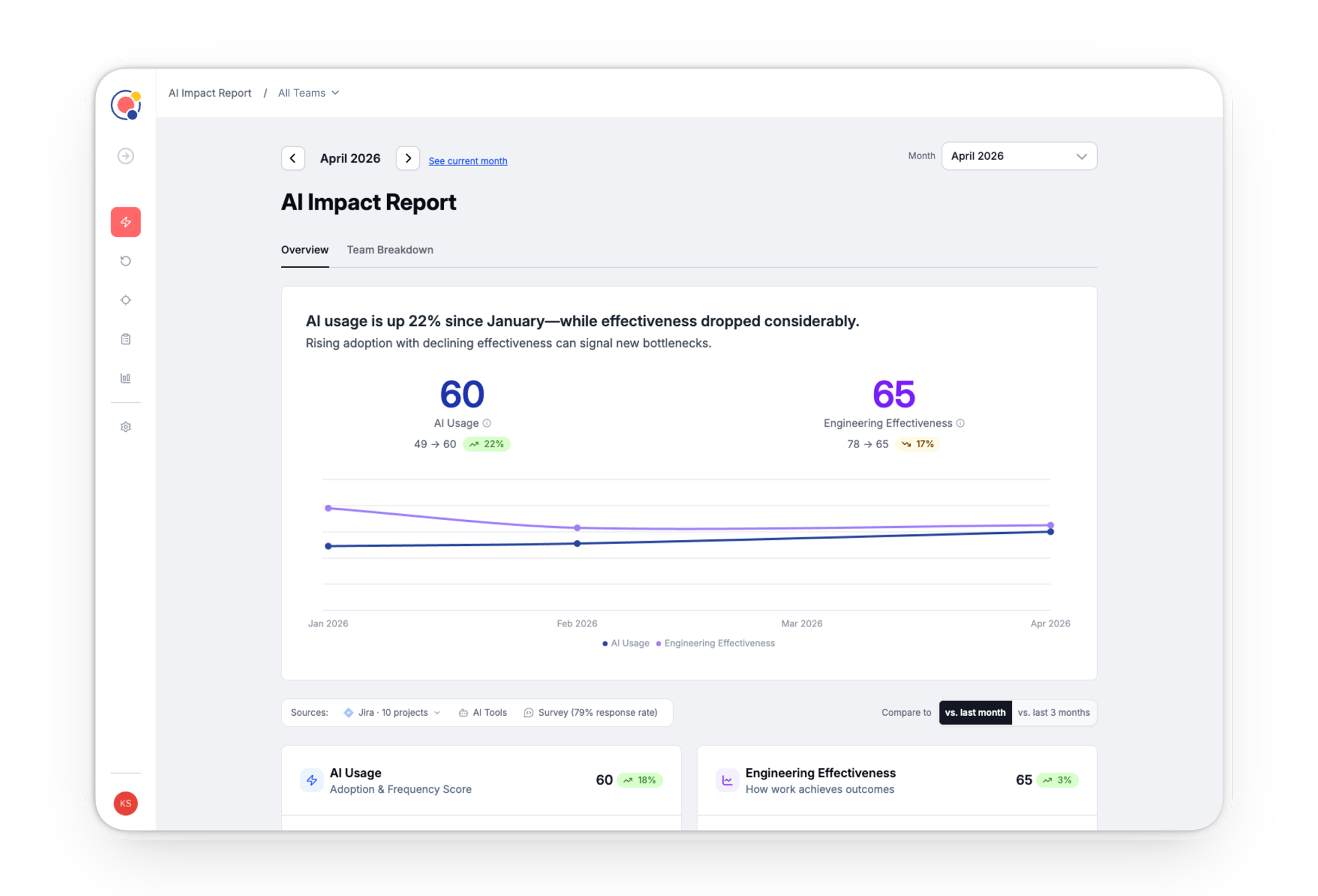
An ambiguous and evolving market space.
Quotient’s core differentiator is our Insights & Actions layer, generated by an LLM trained on our research and data models.
But how can that action layer make relevant observations and tactical recommendations when AI best practices were still forming?
This also meant we were designing the feature while defining our methodology, metrics and calculations in parallel — lots of directions explored, tested, and thrown away.
Prototyping LLM Recommendations
As product owner of our LLM Insights & Actions layer, I needed a sense of what types of insights and recommendations were possible and how we would prompt our model to meet our quality bar.
So I gathered some data, prototyped in Claude, and used what I learned to create a brief we could build towards and an eval we could test against.
lets start with table first to make sure we like the format
- Company:
- Quotient
- Feature:
- AI Impact & Opportunities
- Role:
- Discovery, design, product-partner
Transforming Quotient into an AI-first product.
Limited time to deliver, meet expectations or change them?
I had 2 days to turn around design concepts from a brief.
After a day of deep research, I realized a maturity score is worth nothing if nobody believes the model behind it. So I brought the founders two concepts, not five — the brief, and what I thought it needed to win.
The credibility work outran the feature it was built to support.
The research was a dinner table
I asked to attend our sales dinners with engineering leaders so I could hear how they actually thought and talked about the topic.
I walked away with a set of behaviors that each company used to describe where they were. That formed the basis of the model — it was dictated by behaviors, not numbers — and informed the language that I believe is why it resonated so well with the market.
- Company:
- Quotient
- Feature:
- AI Maturity Model
- Role:
- Discovery, design, GTM strategy
A GTM artifact that became our #1 source of leads.
The ask was to add a section to the page about variable pricing rules like Attendee-Based pricing. The actual problem was that guests couldn’t see what a booking cost until step six of checkout.
The solution was relatively simple but the team was fearful that putting the total cost up front would negatively affect conversion.
The interface wasn’t the hard part. The challenge was getting the team to feel comfortable with a high-stakes decision.
A decision with limited data that paid off
Getting to a decision, not a design
The interface wasn’t the hard part. Moving a nervous team to a decision they owned was.
Adoption data sized the problem — 21% of live hosts were pricing by headcount, invisibly. A cross-functional design studio made product and engineering co-authors instead of reviewers. Then I put the worst case on the table myself.
- Company:
- Peerspace
- Feature:
- Pricing Calculator
- Role:
- Lead designer
Total price upfront — before AirBnB decided it was cool.
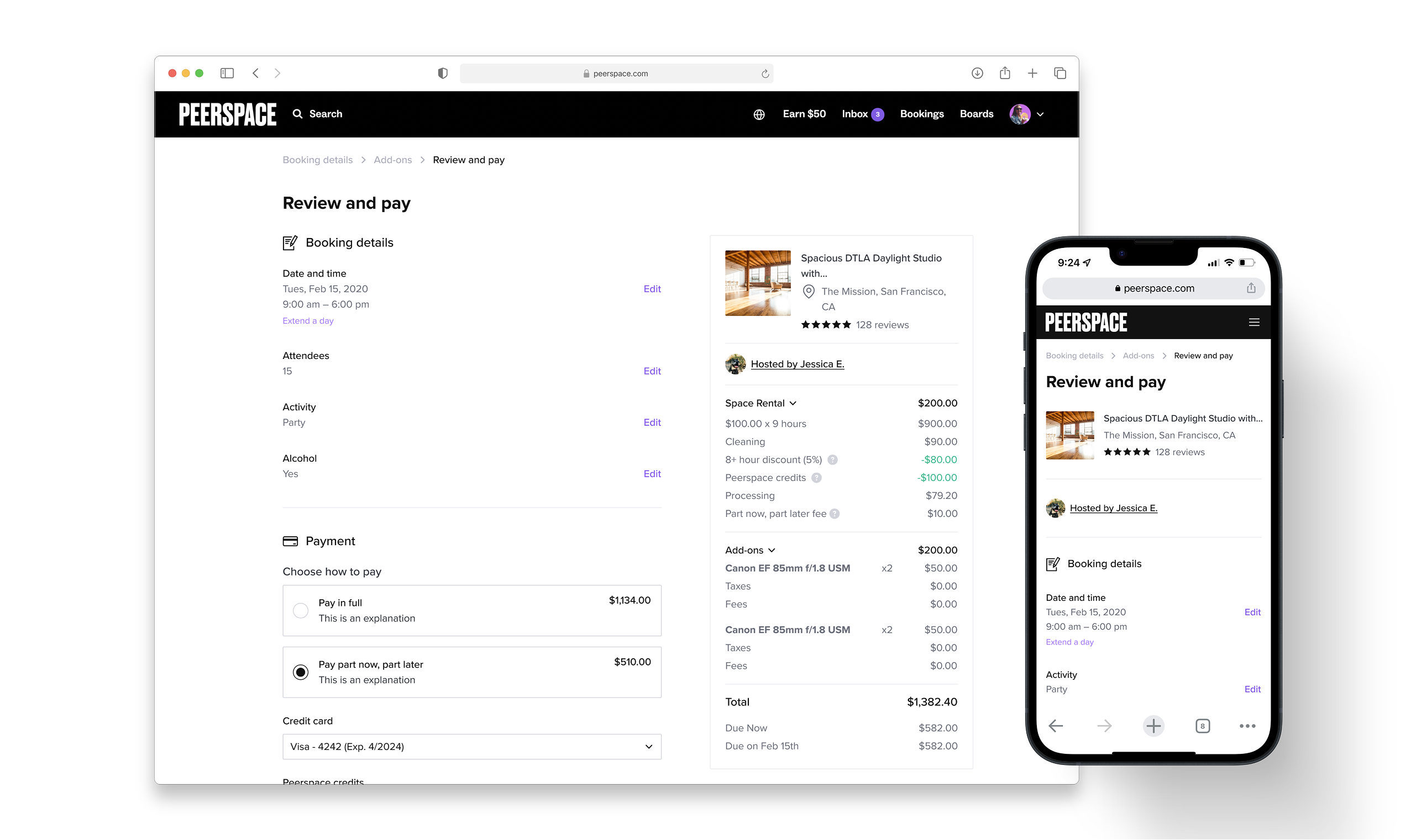
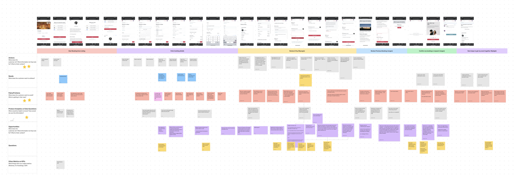
At the time, the team had a broad, shared understanding that there was a lot broken in the current checkout flow, especially on mobile web, which had been neglected for quite some time. Because there seemed to be so much to fix, it was overwhelming to get started. The team was in a state of paralysis, and these issues continued to go unfixed.
+7% conversion — the first time mobile web checkout cleared 60% in over a year
Running the Workshop
With 8 people and only an hour, I divided attendees into pairs and assigned each pair a row/category to take notes on as they went through the checkout flow on their own device. Each pair had 20 minutes to go through the experience and fill out their assigned row. We then used the rest of the time to share, add, piggyback, and refine our post-its as a team.
The completed User Journey Canvas at the conclusion of the workshop.
- Company:
- Peerspace
- Feature:
- Checkout
- Role:
- Lead Designer and PM